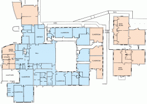
The schools original (1974) design consisted of a simple courtyard, intersected with a central administrative/ entrance block. As the school has enlarged various pieces of new build have been added.
As with any working building, the school will always be something of a prototype, and today the following improvements and alterations are up for consideration.
The layout & rough sketches linked below are indicative rather than definitive.
If you use the school and can think of other ways to improve the building, please post a comment at the bottom of this page.
Various opportunities for improvement have been identified
(click on titles for more detail):
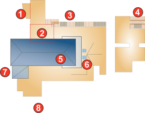
1. WORKSHOP: Power tools to be moved to the far wall, behind a lockable semi glazed partition.
2. KITCHENS: Enlarged by knocking through to adjacent rooms.
3. PERIMETER PATH: Planted pergolas to give semi covered outdoor teaching space.
4. SIXTH FORM BLOCK: Existing glazed shelter to be replaced with planted stained timber alternative.
5. MAIN HALL: Hipped roof extended into existing courtyard. It is possible that at the same time the other end of the hipped roof might be extended over the recent office extension, to provide partial shelter around the front of the building, & give the school’s main elevation a more cohesive appearance.
6. CLASS ROOM: An extension and a conjoined roof ridge have made getting natural light into this space problematic. On further investigation it may be possible to knock light-wells into the North facing roof.
7. COURTYARD: Additional indoor teaching space.
8. OUTDOOR SPACE: Mixed play facilities.


Hi Justin,
I think the layout and information is fantastic. Could you email me the plan you have digitalised for various uses.
Thanks for all your hard work. I hope it’s ok that I have shared this with the senior leaders, I will hold off for the other staff or you may get inundated with responses!
Thanks again
Jonathan